
Web - LinkStyleSelectCard (Deprecated in 1.4)
Definition
정의 | LinkStyleSelectCard |
최적화 대상 | Desktop |
기획 배포 | 완료 |
디자인 가이드 배포 | 완료 |
개발 코드 배포 |
Principle
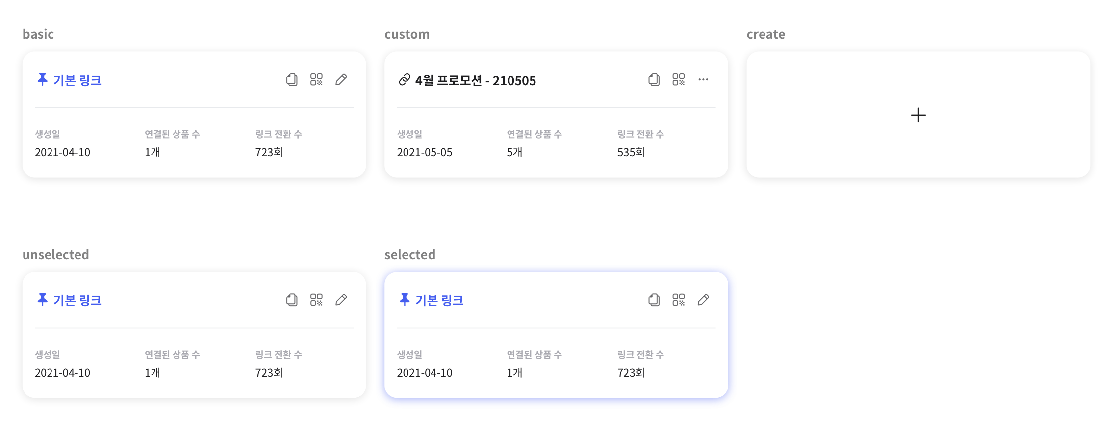
링크 관리에 쓰이는 카드입니다.
basic, custom 타입에서는 선택 시 우측에 오버레이가 뜨며 해당 링크에 대한 상세한 정보를 볼 수 있습니다. (Overlay 참고)
create 타입에서는 선택 시 생성에 관한 화면이 뜹니다.
구성

Spec
Guide
basic, custom일 때 카드 클릭 시 오버레이가 뜹니다.
타이틀 우측 아이콘 버튼은 클릭 시 각각 역할에 맞는 액션이 제공됩니다.
create일 때 카드 클릭 시 링크 생성 화면이 뜹니다.
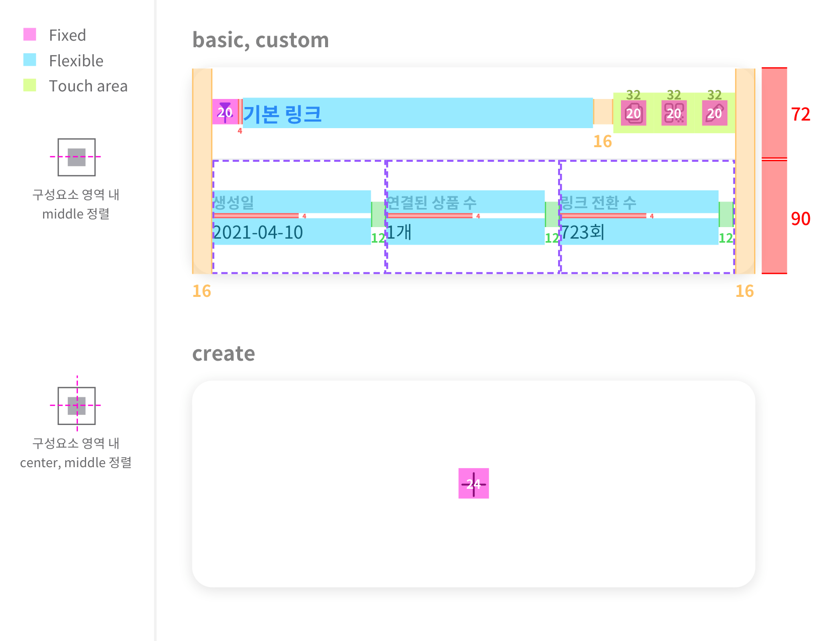
Size, Property
구성 | 내용 |
|---|---|
width |
|
icon |
|
text | TextLabel 참고
|
iBtn | IconButton 참고
|
divider |
|
base | radius : 16px |
shadow |
|
Color 구성
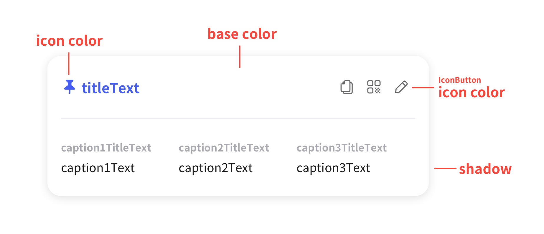
Color Key
구성 | 내용 |
|---|---|
icon color |
|
Text | TextLabel
|
IconButton | iconColorKey : baseColorKey : |
divider color | Divider 내 Color Key 참고 |
base color |
|
shadow | Contents Layer에 소속, elevation-2를 적용합니다. |
Properties
PropName | Description | DataType | DefaultValue |
|---|---|---|---|
linkType | 카드 타입을 결정합니다. | enum | basic |
basicIconName | 링크 타입이 basic일 때, 아이콘 이름을 결정합니다. | enum | ic_xxx |
basicTitleText | 링크 타입이 basic일 때, 주요 텍스트입니다. *1줄 이상 말줄임표 처리 | String | |
basicCaption1TitleText | 링크 타입이 basic일 때, 1번째 링크 정보에 대한 값 중 타이틀 부분입니다. | String | |
basicCaption1Text | 링크 타입이 basic일 때, 1번째 링크 정보에 대한 값 상세 내용입니다. | String | |
basicCaption2TitleText | 링크 타입이 basic일 때, 2번째 링크 정보에 대한 값 중 타이틀 부분입니다. | String | |
basicCaption2Text | 링크 타입이 basic일 때, 2번째 링크 정보에 대한 값 상세 내용입니다. | String | |
basicCaption3TitleText | 링크 타입이 basic일 때, 3번째 링크 정보에 대한 값 중 타이틀 부분입니다. | String | |
basicCaption3Text | 링크 타입이 basic일 때, 3번째 링크 정보에 대한 값 상세 내용입니다. | String | |
basicIBtn1IconName | 링크 타입이 basic일 때, 타이틀 우측에 있는 3개의 버튼 중 좌측에서 1번 아이콘 이름을 결정합니다. | enum | ic_xxx |
basicIBtn2IconName | 링크 타입이 basic일 때, 타이틀 우측에 있는 3개의 버튼 중 좌측에서 2번 아이콘 이름을 결정합니다. | enum | ic_xxx |
basicIBtn3IconName | 링크 타입이 basic일 때, 타이틀 우측에 있는 3개의 버튼 중 좌측에서 3번 아이콘 이름을 결정합니다. | enum | ic_xxx |
customIconName | 링크 타입이 custom일 때, 아이콘 이름을 결정합니다. | enum | ic_xxx |
customTitleText | 링크 타입이 custom일 때, 주요 텍스트입니다. *1줄 이상 말줄임표 처리 | String | |
customCaption1TitleText | 링크 타입이 custom일 때, 1번째 링크 정보에 대한 값 중 타이틀 부분입니다. | String | |
customCaption1Text | 링크 타입이 custom일 때, 1번째 링크 정보에 대한 값 상세 내용입니다. | String | |
customCaption2TitleText | 링크 타입이 custom일 때, 2번째 링크 정보에 대한 값 중 타이틀 부분입니다. | String | |
customCaption2Text | 링크 타입이 custom일 때, 2번째 링크 정보에 대한 값 상세 내용입니다. | String | |
customCaption3TitleText | 링크 타입이 custom일 때, 3번째 링크 정보에 대한 값 중 타이틀 부분입니다. | String | |
customCaption3Text | 링크 타입이 custom일 때, 3번째 링크 정보에 대한 값 상세 내용입니다. | String | |
customIBtn1IconName | 링크 타입이 custom일 때, 타이틀 우측에 있는 3개의 버튼 중 좌측에서 1번 아이콘 이름을 결정합니다. | enum | ic_xxx |
customIBtn1IconFillType | 링크 타입이 custom일 때, 타이틀 우측에 있는 3개의 버튼 중 좌측에서 1번 아이콘 형태를 결정합니다. | enum | line |
customIBtn2IconName | 링크 타입이 custom일 때, 타이틀 우측에 있는 3개의 버튼 중 좌측에서 2번 아이콘 이름을 결정합니다. | enum | ic_xxx |
customIBtn2IconFillType | 링크 타입이 custom일 때, 타이틀 우측에 있는 3개의 버튼 중 좌측에서 2번 아이콘 형태를 결정합니다. | enum | line |
customIBtn3IconName | 링크 타입이 custom일 때, 타이틀 우측에 있는 3개의 버튼 중 좌측에서 3번 아이콘 이름을 결정합니다. | enum | ic_xxx |
customIBtn3IconFillType | 링크 타입이 custom일 때, 타이틀 우측에 있는 3개의 버튼 중 좌측에서 3번 아이콘 형태를 결정합니다. | enum | line |
Values
Related PropName | Value | Description & spec | Visual Ref |
|---|---|---|---|
linkType | basic | 기본 링크 카드입니다. |  |
custom | 커스텀 링크 카드입니다. | 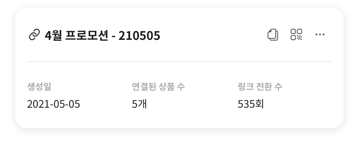 | |
create | 새로 추가할 수 있는 링크 카드입니다. |  | |
basicIconName | ic_xxx | ||
basicTitleText | |||
basicCaption1TitleText | |||
basicCaption1Text | |||
basicCaption2TitleText | |||
basicCaption2Text | |||
basicCaption3TitleText | |||
basicCaption3Text | |||
basicIBtn1IconName | ic_xxx | ||
basicIBtn2IconName | ic_xxx | ||
basicIBtn3IconName | ic_xxx | ||
customIconName | |||
customTitleText | |||
customCaption1TitleText | |||
customCaption1Text | |||
customCaption2TitleText | |||
customCaption2Text | |||
customCaption3TitleText | |||
customCaption3Text | |||
customIBtn1IconName | ic_xxx | ||
customIBtn1IconFillType | line | ||
fill | |||
customIBtn2IconName | ic_xxx | ||
customIBtn2IconFillType | line | ||
fill | |||
customIBtn3IconName | ic_xxx | ||
customIBtn3IconFillType | line | ||
fill |
문서 작성 정보
소유자 / 관리자 | 김혜진 |
|---|---|
변경 이력 |
|