
Web - Select
Definition
정의 | Select |
최적화 대상 | Desktop Mobile |
기획 배포 | 완료 |
디자인 가이드 배포 | 완료 |
개발 코드 배포 | 완료 |
Principle
양식을 보내기위해 시스템 디폴트가 뜨는 옵션들 중에 무언가를 select하게 하는 행위를 말합니다.
현재 Select 선택 시 표시되는 화면은 OS 기본 형태에 맞춰 띄웁니다.
Select는 submit이 함께 있는 Form의 구성요소 중 하나이며, radio와 같은 개념입니다.
Spec
Guide
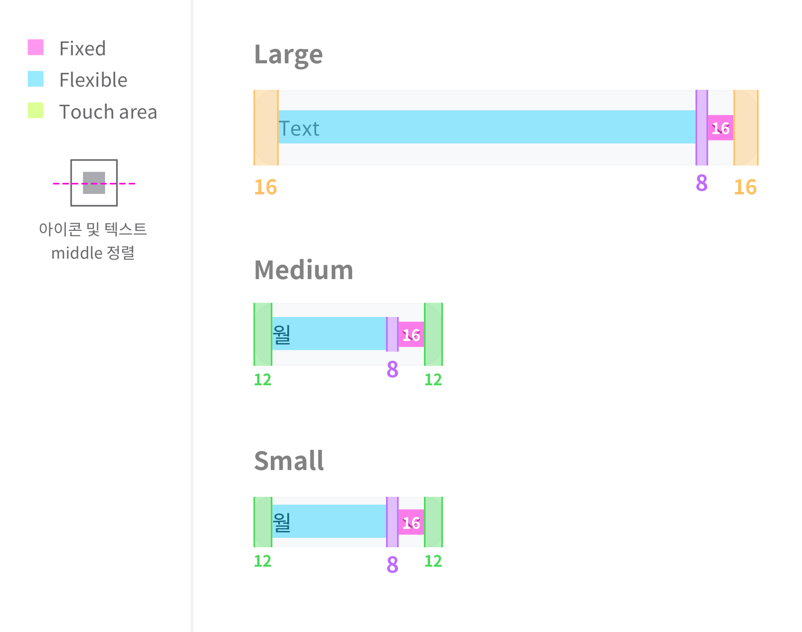
Size
Large | Medium | Small | |
|---|---|---|---|
Height | 48px | 40px | 32px |
Width | 432px | 188px | 188px |
radius | 14px | 12px | 10px |
text |
textLineType : single일 경우, 행간 singleLine 적용 그 외 form2에 적용한 행간 적용 |
textLineType : single일 경우, 행간 singleLine 적용 그 외 form2에 적용한 행간 적용 |
textLineType : single일 경우, 행간 singleLine 적용 그 외 form2에 적용한 행간 적용 |
icon |
|
|
|
Color 구성
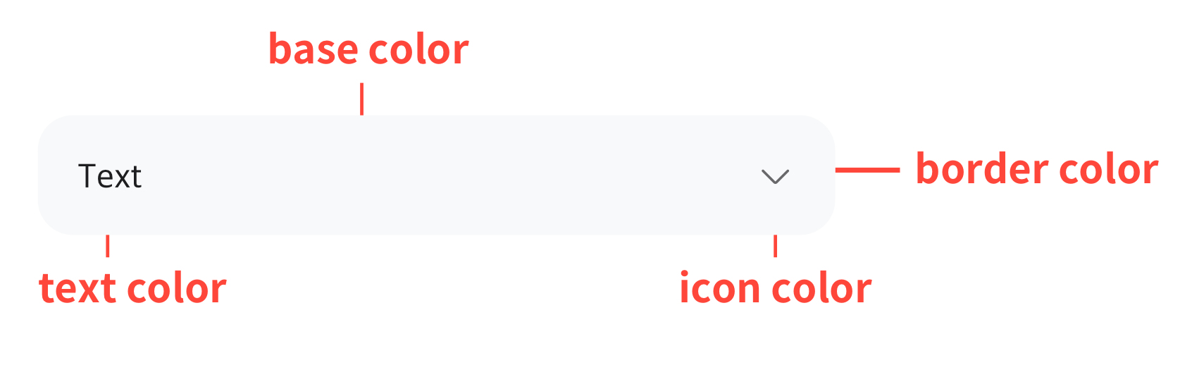
Color Key
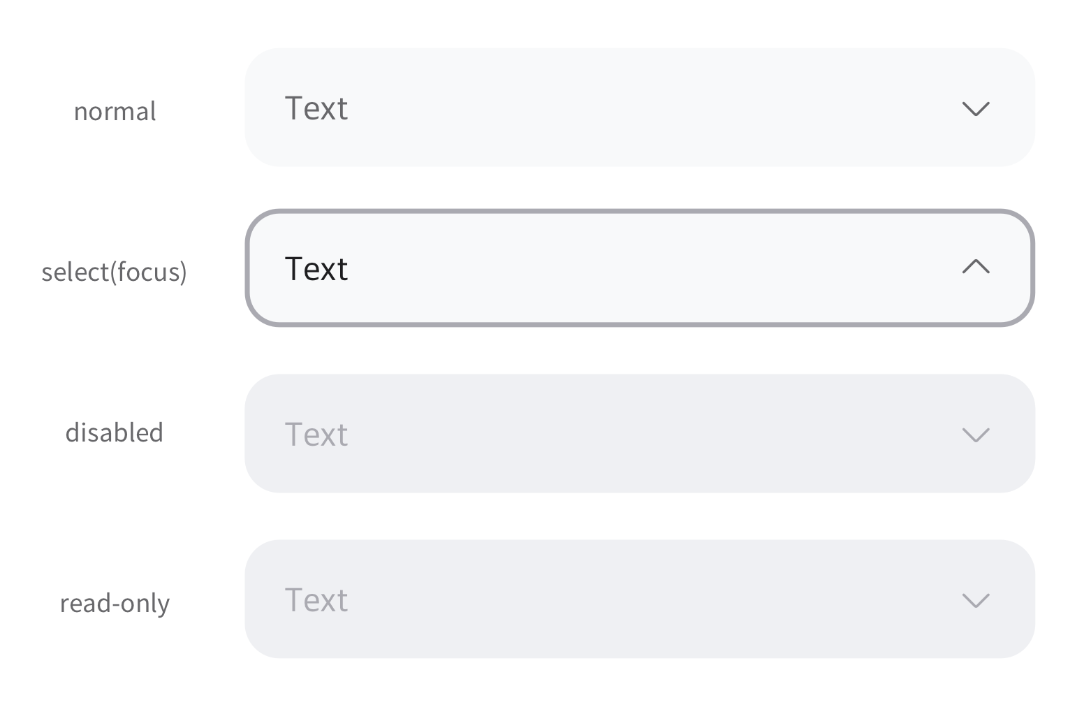
셀렉트에는 다양한 상태들이 존재합니다. 요소들의 컬러 변화로 상태들을 표현합니다.
textColor | iconColor | borderColor | baseColor | |
|---|---|---|---|---|
normal |
|
|
|
|
focus |
|
|
|
|
selected |
|
|
|
|
disabled |
|
|
|
|
read_only |
|
|
|
|
hover | - | - | - |
|
pressed | - | - | - |
|
colorTheme : dark
textColor | iconColor | borderColor | baseColor | |
|---|---|---|---|---|
normal |
|
|
|
|
focus |
|
|
|
|
selected |
|
|
|
|
disabled |
|
|
|
|
read_only |
|
|
|
|
hover | - | - | - |
|
pressed | - | - | - |
|
Properties
responsiveMode
Added in 1.2
화면에 맞춰 늘릴 것인지 결정합니다. (반응형)
기획 지시사항
기획서 상 작성 방법 : Enum Values 중 하나를 사용함
Type |
|
|---|---|
Default |
|
Enum Values Description | |
|---|---|
| 사용하지 않음 |
| 사용함 |
hintText
선택하기 전 기본으로 표시할 값입니다.
기획 지시사항
기획서 상 작성 방법 : 텍스트만 기술
Type |
|
|---|---|
Default | - |
defaultText (Deprecated in 1.2)
Deprecated in 1.2
선택하기 전 기본으로 표시할 값입니다.
기획 지시사항
기획서 상 작성 방법 : 텍스트만 기술
Type |
|
|---|---|
Default | - |
defaultValue
Added in 1.2
지정된 기본 값을 보여줘야 할 때 사용합니다.
*hintText와 함께 사용할 수 없습니다.
기획 지시사항
기획서 상 작성 방법 : 텍스트만 기술
Type |
CODE
|
|---|---|
Default | - |
value
Added in 1.4
select의 값입니다. (예외 상황이 있을 때 원래 값이나 다른 값을 설정하기위해 주로 쓰입니다.)
기획 지시사항
기획서 상 작성 방법 : 기획자가 직접 prop을 기술하지 않음
Type |
CODE
|
|---|---|
Default | - |
valueArray*
옵션으로 표시될 값들의 배열입니다.
기획 지시사항
기획서 상 작성 방법 : 텍스트만 기술
Type |
CODE
|
|---|---|
Default | - |
size
크기를 결정합니다.
기획 지시사항
기획서 상 작성 방법 : Enum Values 중 하나를 사용함
Type |
|
|---|---|
Default |
|
Enum Values Description | |
|---|---|
|
CODE
|
|
CODE
|
|
CODE
|
| 화면 영역에 꽉 차게 (높이는 large동일) *responsiveMode의 추가로 인해 추후 삭제 고려 |
state
상태를 결정합니다.
기획 지시사항
기획서 상 작성 방법 : Enum Values 중 하나를 사용함
Type |
|
|---|---|
Default |
|
Enum Values Description | |
|---|---|
| 기본 상태 입니다. |
| 읽기 전용입니다. (입력창 수정 불가) |
| 비활성화 상태입니다. |
colorTheme
컬러의 프리셋 테마입니다.
기획 지시사항
기획서 상 작성 방법 : Enum Values 중 하나를 사용함
Type |
|
|---|---|
Default |
|
Enum Values Description | |
|---|---|
| 기본값을 따릅니다. |
| *톤 설정과 상관없이 어두운 배경에 올라갈 때 사용합니다. (spec 기술 참고) |
customWidth
Added in 1.4
직접 지정한 Select의 사이즈를 결정합니다. (단위도 함께 적어주어야 합니다.)
*반드시 디자인 검수후에 사용가능합니다.
기획 지시사항
기획서 상 작성 방법 : 텍스트만 기술
Type |
|
|---|---|
Default | - |
onChange
Added in 1.2
데이터가 변경되는 시점에 이벤트를 부여합니다.
기획 지시사항
기획서 상 작성 방법 : 기획자가 직접 prop을 기술하지 않음
Type |
|
|---|---|
Default | - |
문서 작성 정보
소유자 / 관리자 | 김혜진, 박윤규 |
|---|---|
변경 이력 |
|