
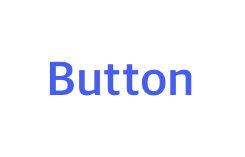
Web - TextButton
제출용 버튼입니다. 업로드용 버튼은 Web - UploadTextButton 문서 참고
Definition
정의 | TextButton |
최적화 대상 | Desktop Mobile |
기획 배포 | 완료 |
디자인 가이드 배포 | 완료 |
개발 코드 배포 | 완료 |
Principle
얼럿 다이얼로그와 같이 어떠한 영역을 가진 곳에 사용하게 되면 콘텐츠를 방해하지 않으면서 시각적으로 관련되어 보일 수 있습니다. 브랜드 컬러로 사용하여 좀 더 주목성을 가질 수 있게 합니다. (AlertDialog 참고)
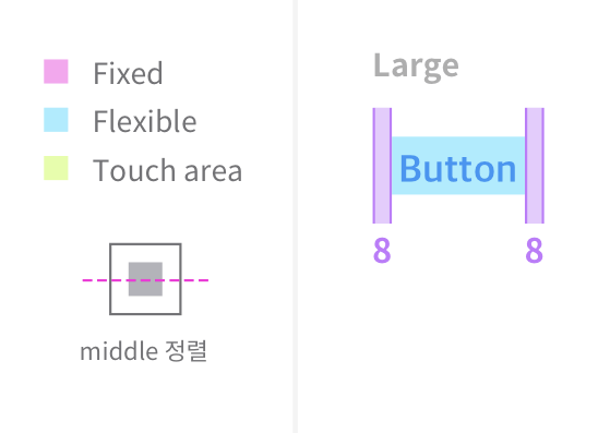
MainButton과는 양 옆 padding 값 차이가 있고, 사이즈는 현재 large가 있습니다.
AlertDialog에 쓰여지고 있습니다.
버튼에는 다양한 상태들이 존재합니다. 이 상태들은 버튼을 구성하는 요소들의 컬러 변화로 알려집니다.
사이즈별 용법
버튼은 사이즈별로 중요도와 용법이 다릅니다.
Large (48px) |
|
Medium (40px) | |
Small (32px) | |
XSmall (24px) |
Spec
Guide
Size, Property
Large | Medium | Small | XSmall | |
|---|---|---|---|---|
Height | 48px | 40px | 32px | 24px |
Width | - | - | - | - |
text |
|
|
|
|
iconSize | 20px | 16px | 16px | N/A |
radius | 14px | 14px | 10px | 4px |
Color Key
colorTheme : none
textColor | baseColor | |
|---|---|---|
enabled | TextLabel
| N/A |
hovered | TextLabel
|
|
pressed | TextLabel
|
|
disabled | TextLabel
| N/A |
colorTheme : red
textColor | baseColor | |
|---|---|---|
enabled | TextLabel
| N/A |
hovered | TextLabel
|
|
pressed | TextLabel
|
|
disabled | TextLabel
| N/A |
colorTheme : grey_01
textColor | baseColor | |
|---|---|---|
enabled | TextLabel
| N/A |
hovered | TextLabel
|
|
pressed | TextLabel
|
|
disabled | TextLabel
| N/A |
colorTheme : grey2
textColor | baseColor | |
|---|---|---|
enabled | TextLabel
| N/A |
hovered | TextLabel
|
|
pressed | TextLabel
|
|
disabled | TextLabel
| N/A |
colorTheme : white
textColor | baseColor | |
|---|---|---|
enabled | TextLabel
| N/A |
hovered | TextLabel
|
|
pressed | TextLabel
|
|
disabled | TextLabel
| N/A |
colorTheme : white2
textColor | baseColor | |
|---|---|---|
enabled | TextLabel
| N/A |
hovered | TextLabel
|
|
pressed | TextLabel
|
|
disabled | TextLabel
| N/A |
Properties
responsiveMode
Added in 1.2
화면에 맞춰 늘릴 것인지 결정합니다. (반응형)
기획 지시사항
기획서 상 작성 방법 : Enum Values 중 하나를 사용함
Type |
|
|---|---|
Default |
|
Enum Values Description | |
|---|---|
| 사용하지 않음 |
| 사용함 |
text
표시할 텍스트 값입니다. (최대 12자로 기획 권장)
기획 지시사항
기획서 상 작성 방법 : 텍스트만 기술
Type |
|
|---|---|
Default | - |
size
크기를 결정합니다. 단순히 요소의 width, height 뿐만 아니라 텍스트 크기, 아이콘 크기 등이 다 포함됩니다.
기획 지시사항
기획서 상 작성 방법 : Enum Values 중 하나를 사용함
Type |
|
|---|---|
Default |
|
Enum Values Description | |
|---|---|
|
CODE
|
| |
| |
| |
| responsive - large (full-width) |
fontWeight
텍스트의 굵기를 의미합니다.
기획 지시사항
기획서 상 작성 방법 : Enum Values 중 하나를 사용함
Type |
|
|---|---|
Default | - |
state
Added in 1.2
상태를 결정합니다.
기획 지시사항
기획서 상 작성 방법 : Enum Values 중 하나를 사용함
Type |
|
|---|---|
Default |
|
Enum Values Description | |
|---|---|
| 기본 상태 입니다. |
| 비활성화 상태입니다. |
colorTheme
컬러의 프리셋 테마입니다.
기획 지시사항
기획서 상 작성 방법 : Enum Values 중 하나를 사용함
Type |
|
|---|---|
Default |
|
Enum Values Description | |
|---|---|
| 기본값입니다. |
|
Added in 1.4 빨간색 텍스트 버튼입니다. (sysTextError) *커스텀 컬러 적용과 상관 없이 항상 빨간색으로 표현됩니다. (시스템 컬러)  |
|
Added in 1.4 sysTextPrimary 컬러가 입혀진 텍스트 버튼입니다. *커스텀 컬러 적용과 상관 없이 항상 sysTextPrimary 컬러로 표현됩니다. (시스템 컬러)  |
|
Added in 2.1 sysTextSecondary 컬러가 입혀진 텍스트 버튼입니다. *커스텀 컬러 적용과 상관 없이 항상 sysTextSecondary 컬러로 표현됩니다. (시스템 컬러)  |
|
Added in 1.4 white 컬러가 입혀진 텍스트 버튼입니다. *커스텀 컬러 적용과 상관 없이 항상 white 컬러로 표현됩니다. (시스템 컬러)  default 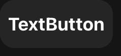 hover 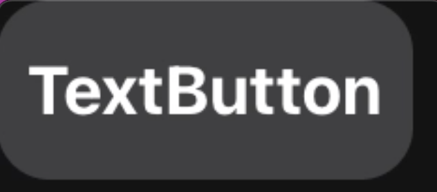 pressed |
|
Added in 1.9 white 컬러가 입혀진 텍스트 버튼입니다. *커스텀 컬러 적용과 상관 없이 항상 white 컬러로 표현됩니다. (시스템 컬러) 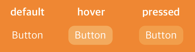 |
type
Added in 1.2
button 태그 자체의 type을 결정합니다.
기획 지시사항
기획서 상 작성 방법 : 기획자가 직접 prop을 기술하지 않음
Type |
|
|---|---|
Default |
|
Enum Values Description | |
|---|---|
| 기본적인 버튼의 역할을 합니다. |
| form data를 제출하는 버튼의 역할을 합니다. |
| form data를 초기 값으로 재설정하는 버튼의 역할을 합니다. |
onClick
Added in 1.2
클릭이 된 시점에 이벤트를 부여합니다.
기획 지시사항
기획서 상 작성 방법 : 기획자가 직접 prop을 기술하지 않음
Type |
|
|---|---|
Default | - |
문서 작성 정보
소유자 / 관리자 | 김혜진, 박윤규 |
|---|---|
변경 이력 |
|