
Web - PageTitleTextGroup (Added in 1.3)
Added in 1.3.0
Definition
정의 | PageTitleTextGroup |
최적화 대상 | Desktop |
기획 배포 | 완료 |
디자인 가이드 배포 | 완료 |
개발 코드 배포 | 완료 |
Principle
레이아웃 유형 중 WF 제외한 나머지 유형들에서 ContentsContainer 안에 전체 타이틀 역할로 들어가는 요소입니다.
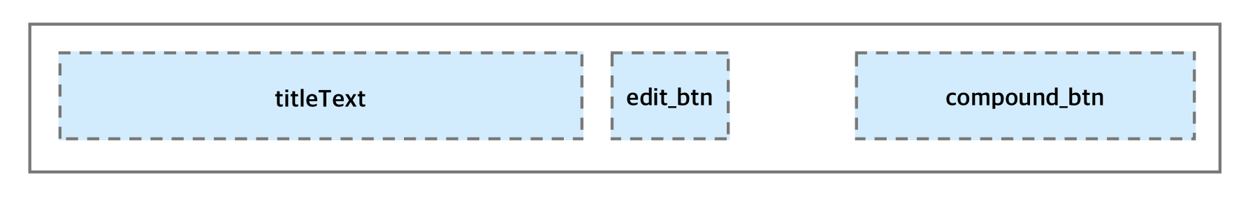
구성
Spec
Guide
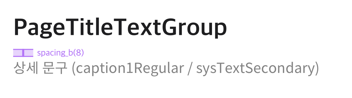
상세 문구 관련 가이드
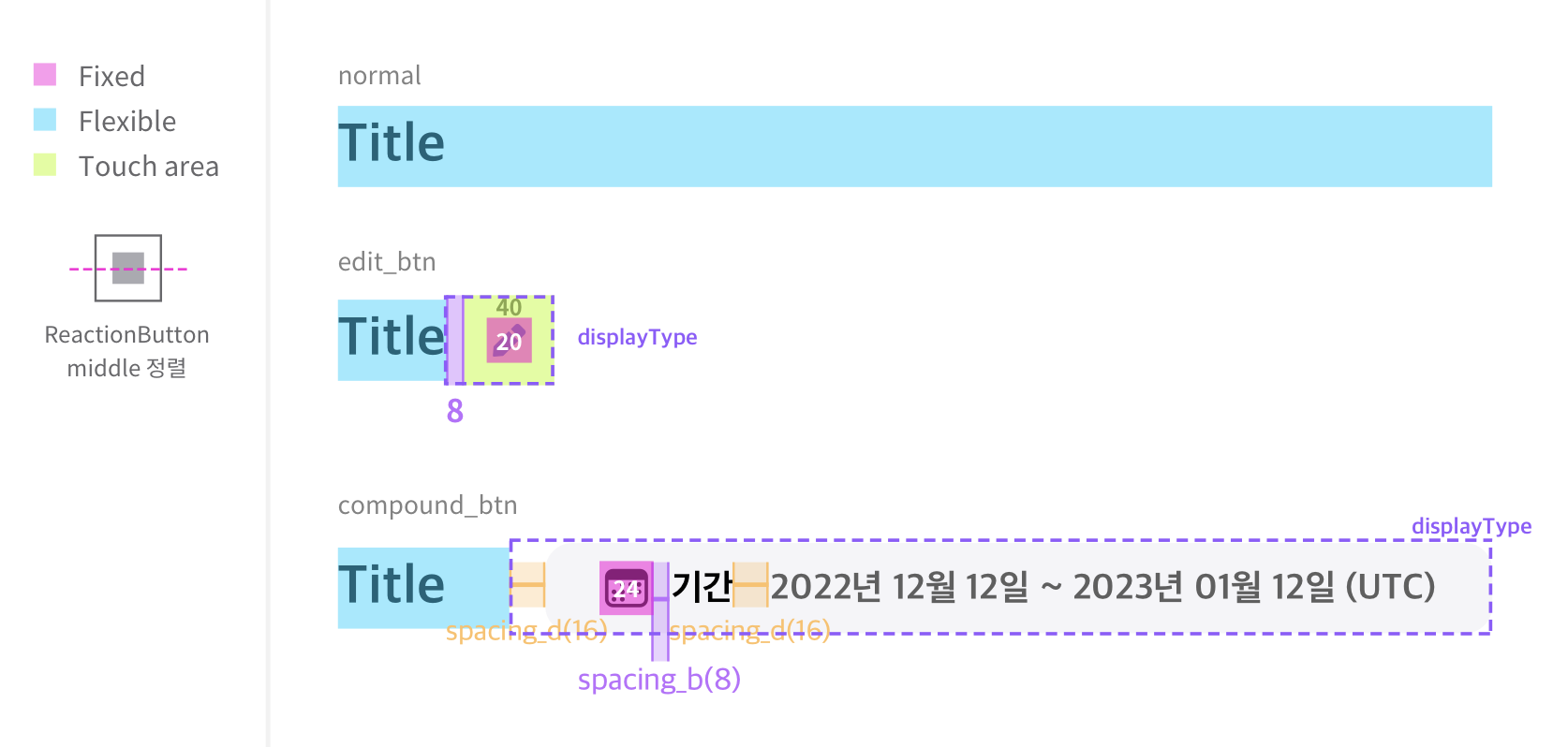
Size, Property
(color와 관련한 사항은 하단에 기술)
구성 | 내용 |
|---|---|
height | 40px |
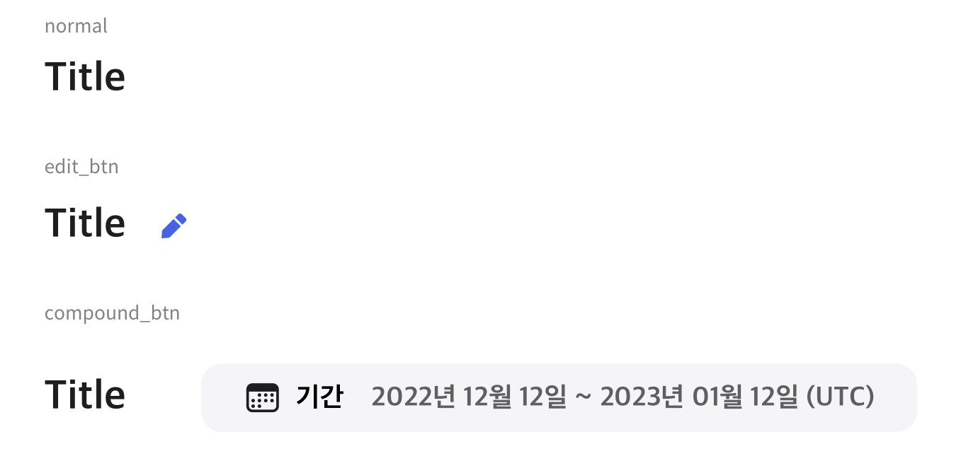
text |
|
iBtn (displayType : edit_btn) |
|
기간 설정 버튼 (displayType : compound_btn) |
Web - Icon 참고
|
Color 구성
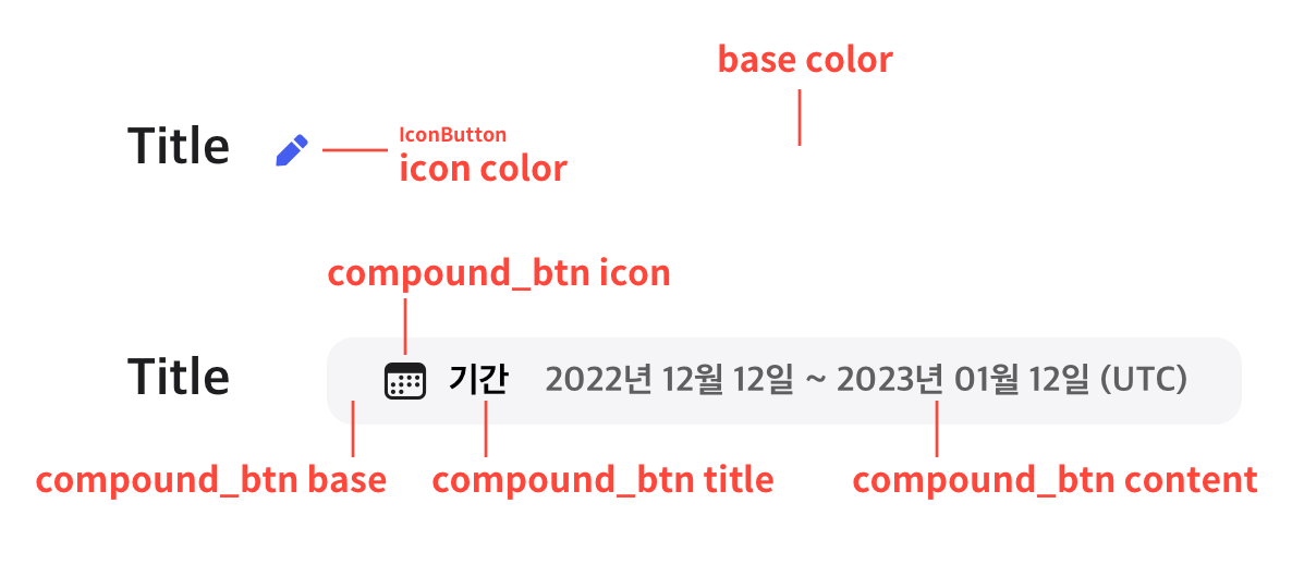
Color Key
구성 | 내용 |
|---|---|
titleText | TextLabel
|
IconButton |
|
base color |
|
compound_btn base | ContentSheet
|
compound_btn icon | Icon
|
compound_btn title | TextLabel
|
compound_btn content | TextLabel
|
Properties
titleText*
Added in 1.3
표시할 텍스트 값입니다.
기획 지시사항
기획서 상 작성 방법 : 텍스트만 기술
Type |
|
|---|---|
Default | - |
tooltipText
Added in 1.9
해당 타이틀 대한 설명 문구를 표시할 툴팁 텍스트 값입니다.
기획 지시사항
기획서 상 작성 방법 : 텍스트만 기술
Type |
|
|---|---|
Default | - |
displayType
Added in 1.3
TitleTextGroups의 유형을 결정합니다.
기획 지시사항
기획서 상 작성 방법 : Enum Values 중 하나를 사용함
Type |
|
|---|---|
Default |
|
Enum Values Description | ||
|---|---|---|
| 타이틀만 있는 기본 형태 |
|
|
|
Deprecated  |
| 버튼의 유형 (edit) |  |
| title text와 content text가 화합되어 있는 형태의 버튼이 보여지는 형태 |
Added in 1.9  |
btn1State
Added in 1.3
displayType가 'edit_btn'인 경우 icon button의 상태를 결정합니다.
기획 지시사항
기획서 상 작성 방법 : Enum Values 중 하나를 사용함
Type |
|
|---|---|
Default |
|
Enum Values Description | |
|---|---|
| 기본 상태 입니다. |
| 비활성화 상태입니다. |
compoundBtnIconName
Added in 1.9
displayType이 "compound_btn"일 경우 사용 될 아이콘 이름을 의미합니다. 사용할 수 있는 아이콘은 미리 정해져있습니다.
기획 지시사항
기획서 상 작성 방법 : Enum Values 중 하나를 사용함
Type |
|
|---|---|
Default | - |
Enum Values Description |
|---|
Icon 컴포넌트의 iconName 값 중 하나를 부여합니다. (ic_xxx의 형식입니다.) |
compoundBtnIconFillType
Added in 1.9
displayType이 "compound_btn"일 경우 버튼에 사용 될 아이콘의 형태를 결정합니다.
기획 지시사항
기획서 상 작성 방법 : Enum Values 중 하나를 사용함
Type |
|
|---|---|
Default |
|
Enum Values Description | |
|---|---|
| line 형태의 아이콘을 사용합니다. |
| fill 형태의 아이콘을 사용합니다. |
compoundBtnTitleText
Added in 1.9
displayType이 "compound_btn"일 경우 버튼에 표시할 타이틀 역할의 텍스트 값 입니다.
기획 지시사항
기획서 상 작성 방법 : 텍스트만 기술
Type |
|
|---|---|
Default | - |
compoundBtnContentText
Added in 1.9
displayType이 "compound_btn"일 경우 버튼에 표시할 타이틀 역할의 텍스트 값 입니다.
기획 지시사항
기획서 상 작성 방법 : 텍스트만 기술
Type |
|
|---|---|
Default | - |
onClickBtn1
Added in 1.3
displayType가 'edit_btn'인 경우 해당 button이 클릭이 된 시점에 이벤트를 부여합니다.
기획 지시사항
기획서 상 작성 방법 : 기획자가 직접 prop을 기술하지 않음
Type |
|
|---|---|
Default | - |
onClickCompoundBtn
Added in 1.9
displayType가 'compound_btn'인 경우 해당 button이 클릭이 된 시점에 이벤트를 부여합니다.
기획 지시사항
기획서 상 작성 방법 : 기획자가 직접 prop을 기술하지 않음
Type |
|
|---|---|
Default | - |
문서 작성 정보
소유자 / 관리자 | 김혜진, 박윤규 |
|---|---|
변경 이력 |
|