
Web - UploadMainButton
업로드용 버튼입니다. 제출용 버튼은 Web - MainButton 문서 참고
*현재 MainButton 문서 복제한 상태이며, 추후 자세한 내용 정리 들어갈 예정 (Properties정리는 완료)
Definition
정의 | MainButton |
최적화 대상 | Desktop Mobile |
기획 배포 | 완료 |
디자인 가이드 배포 | 완료 |
개발 코드 배포 | 완료 |
Principle
버튼은 이용자들이 원하는 기능을 실행하거나 선택을 할 수 있게 해주는 요소입니다. 그 중 메인 버튼은 화면 내 상호 작용이 필요할 때 사용하는 버튼입니다.
또한 버튼은 fixed width 가 존재하지 않습니다. TextLabel과의 padding 간격으로 너비가 결정되고, 반응형일 경우에는 Content width (부모)의 넓이를 따라갑니다.
종류
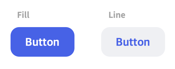
화면 내 중요도에 따라 styleTheme에서 primary와 secondary를 선택하여 사용할 수 있습니다.
fillType은 외적인 형태를 결정짓는 요소입니다.
Primary / Fill fillType | Secondary / Fill fillType | |
|---|---|---|
Purpose | 가장 중요도가 높은 곳에 쓰이며, 사용자의 액션을 적극적으로 유도하는데 사용하는 버튼입니다.
| 일반적으로 사용하는 기본 버튼입니다. Fill 버튼 보다 낮은 주목성을 갖습니다. (중간 강조) 페이지 내 Fill 버튼이 있는 경우 보조 버튼으로 함께 사용할 수 있고, 한 페이지에 여러 개가 존재할 수 있습니다. |
Variation | 텍스트나 아이콘을 포함하고 있으며 아이콘은 옵션입니다.
| 텍스트나 아이콘을 포함하고 있으며 아이콘은 옵션입니다.
|
사이즈별 용법
버튼은 사이즈별로 중요도와 용법이 다릅니다.
Primary / Fill fillType | Secondary / Fill fillType | |
|---|---|---|
Large (48px) |
|
|
Medium (40px) |
|
|
Small (32px) |
|
|
XSmall (24px) |
Spec
Guide
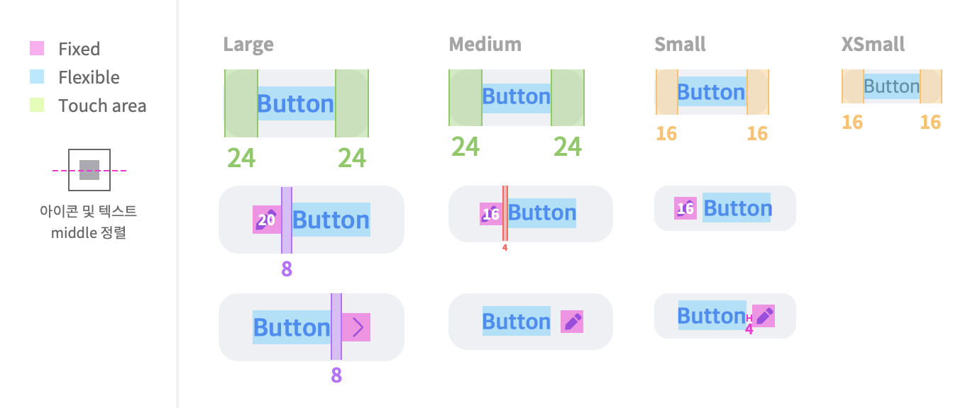
Size, Property
Large | Medium | Small | XSmall | |
|---|---|---|---|---|
Height | 48px | 40px | 32px | 24px |
Width | min-width : 96px | min-width : 64px | min-width : 48px | min-width : 48px |
radius | 14px | 12px | 10px | 8px |
text |
textLineType : single일 경우, 행간 singleLine 적용 그 외 body1에 적용한 행간 적용 |
textLineType : single일 경우, 행간 singleLine 적용 그 외 body2에 적용한 행간 적용 |
textLineType : single일 경우, 행간 singleLine 적용 그 외 caption1에 적용한 행간 적용 |
textLineType : single일 경우, 행간 singleLine 적용 그 외 caption1에 적용한 행간 적용 |
icon |
|
|
| N/A |
Color 구성
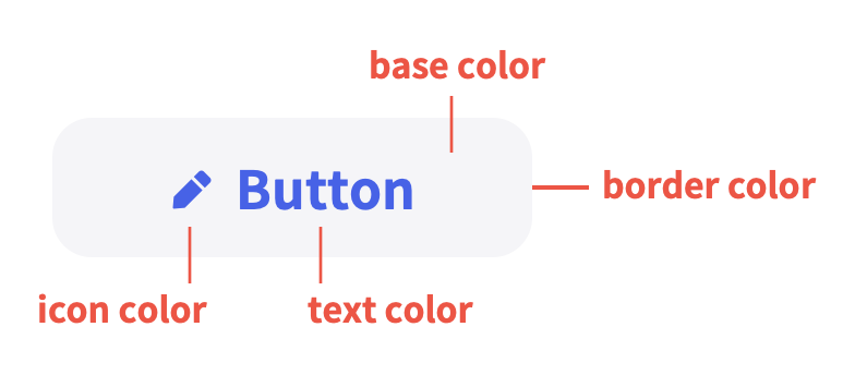
Color Key
버튼에는 다양한 상태들이 존재합니다. 버튼을 구성하는 요소들의 컬러 변화로 상태들을 표현합니다.
Primary
textColor | iconColor | baseColor | |
|---|---|---|---|
enabled |
|
|
|
hover |
|
|
|
pressed |
|
|
|
disabled |
|
|
*hover, pressed 액션 없음 |
Secondary
textColor | iconColor | baseColor | |
|---|---|---|---|
enabled |
|
|
|
hover |
|
|
|
pressed |
|
|
|
disabled |
|
|
*hover, pressed 액션 없음 |
fillType : Line (deprecated 예정)
textColor | iconColor | borderColor | baseColor | |
|---|---|---|---|---|
enabled |
|
|
|
|
hover |
|
|
|
|
pressed |
|
|
|
|
disabled |
|
|
|
|
colorTheme : line3 (deprecated 예정)
textColor | iconColor | borderColor | baseColor | |
|---|---|---|---|---|
enabled |
|
|
|
|
hover |
|
|
|
|
pressed |
|
|
|
|
disabled |
|
|
|
|
colorTheme : primary1 (styleTheme의 primary를 참고한다.)
textColor | iconColor | baseColor | |
|---|---|---|---|
enabled |
|
|
|
hover |
|
|
|
pressed |
|
|
|
disabled |
|
|
*hover, pressed 액션 없음 |
colorTheme : secondary1 (styleTheme의 secondary를 참고한다.)
textColor | iconColor | baseColor | |
|---|---|---|---|
enabled |
|
|
|
hover |
|
|
|
pressed |
|
|
|
disabled |
|
|
*hover, pressed 액션 없음 |
Properties
responsiveMode
Added in 1.2
화면에 맞춰 늘릴 것인지 결정합니다. (반응형)
기획 지시사항
기획서 상 작성 방법 : Enum Values 중 하나를 사용함
Type |
|
|---|---|
Default |
|
Enum Values Description | |
|---|---|
| 사용하지 않음 |
| 사용함 |
text
표시할 텍스트 값입니다.
기획 지시사항
기획서 상 작성 방법 : 텍스트만 기술
Type |
|
|---|---|
Default | - |
shapeType
Added in 1.4
버튼의 외관 형태를 결정합니다.
Type |
|
|---|---|
Default |
|
Enum Values Description | |
|---|---|
| 둥근 직사각형 형태의 shapeType |
| 직사각형 형태의 shapeType |
fillType
디자인 표현이 선형인지, 면인지를 의미합니다.
*styleTheme은 중요도에 따른 선택이고, fillType은 외적인 형태를 결정짓는 요소입니다. 현재는 사용을 권장하지 않습니다.
기획 지시사항
기획서 상 작성 방법 : Enum Values 중 하나를 사용함
Type |
|
|---|---|
Default |
|
Enum Values Description | |
|---|---|
| 면형으로 표현되는 버튼 fillType |
| 선형으로 표현되는 버튼 fillType |
styleTheme
Added in 1.4
외형의 프리셋 테마입니다.
Type |
|
|---|---|
Default |
|
Enum Values Description | |
|---|---|
| 주요로 사용하는 버튼입니다.  |
| Primary 버튼과 함께 쓰는 것을 권장합니다.  |
size
크기를 결정합니다. 단순히 요소의 width, height 뿐만 아니라 텍스트 크기, 아이콘 크기 등이 다 포함됩니다.
기획 지시사항
기획서 상 작성 방법 : Enum Values 중 하나를 사용함
Type |
|
|---|---|
Default |
|
Enum Values Description | |
|---|---|
| 높이 48px |
| 높이 40px |
| 높이 32px |
| 높이 24px |
| responsive - large (full-width) |
fontWeight
텍스트의 굵기를 의미합니다.
기획 지시사항
기획서 상 작성 방법 : Enum Values 중 하나를 사용함
Type |
|
|---|---|
Default |
|
textColorKey
현재는 사용하지 않습니다.
텍스트 컬러입니다.
Type | - |
|---|---|
Default | - |
baseColorKey
현재는 사용하지 않습니다.
배경 컬러입니다. *fillType이 fill일 경우에만 적용 (fillType이 line일 땐 무시)
Type | - |
|---|---|
Default | - |
borderColorKey
현재는 사용하지 않습니다.
라인의 컬러입니다. *fillType이 line일 경우에만 적용 (fillType이 fill일 땐 무시)
Type | - |
|---|---|
Default | - |
iconMode
아이콘 유무와 위치를 결정합니다.
기획 지시사항
기획서 상 작성 방법 : Enum Values 중 하나를 사용함
Type |
|
|---|---|
Default |
|
Enum Values Description | |
|---|---|
| 아이콘을 사용하지 않습니다. |
| 아이콘을 왼쪽에 사용합니다. |
| 아이콘을 오른쪽에 사용합니다. |
iconFillType
아이콘의 형태를 결정합니다.
기획 지시사항
기획서 상 작성 방법 : Enum Values 중 하나를 사용함
Type |
|
|---|---|
Default |
|
Enum Values Description | |
|---|---|
| line 형태의 아이콘을 사용합니다. |
| fill 형태의 아이콘을 사용합니다. |
iconName
아이콘 이름을 의미합니다. 사용할 수 있는 아이콘은 미리 정해져있습니다.
기획 지시사항
기획서 상 작성 방법 : Enum Values 중 하나를 사용함
Type |
|
|---|---|
Default | - |
Enum Values Description |
|---|
Icon 컴포넌트의 iconName 값 중 하나를 부여합니다. (ic_xxx의 형식입니다.) |
state
Added in 1.2
버튼의 상태를 결정합니다.
기획 지시사항
기획서 상 작성 방법 : Enum Values 중 하나를 사용함
Type |
|
|---|---|
Default |
|
Enum Values Description | |
|---|---|
| 기본 상태 입니다. |
| 비활성화 상태입니다. |
shadow
현재는 사용하지 않습니다.
버튼의 외관 형태를 결정합니다.
Type |
|
|---|---|
Default |
|
Enum Values Description | |
|---|---|
| 그림자 없음 |
| 그림자 표시 |
colorTheme
컬러의 프리셋 테마입니다.
*현재는 fillType이 line일 경우에만 적용 (fillType이 fill일 땐 무시)추후 fill1이라는 value가 나온다면 이건 fillType이 fill일 때만 적용한다.
*colorTheme에서 text 컬러는 textLabel에 부여되어 있는 컬러를 사용 하는 것이 아니라, ui_형식의 컬러를 textLabel의 colorOverride를 활용하여 부여한다.
기획 지시사항
기획서 상 작성 방법 : Enum Values 중 하나를 사용함
Type |
|
|---|---|
Default |
|
Enum Values Description | ||
|---|---|---|
| 기본값 사용 |  |
| *base color는 spec 참고 (deprecated 예정)
CODE
|  |
| *base color는 spec 참고 (deprecated 예정)
CODE
|  |
| *톤 설정과 상관없이 어두운 배경에 올라갈 때 사용합니다. (spec 기술 참고) (deprecated 예정) |  |
|
Added in 1.8 주로 대화형 레이아웃 화면일 때 사용하는 버튼입니다.  | |
|
Added in 1.8 주로 대화형 레이아웃 화면일 때 사용하는 버튼입니다. 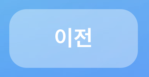 | |
accept
Added in 1.2
특정 확장자 혹은 타입의 파일만 선택할 수 있게 합니다.
기획 지시사항
기획서 상 작성 방법 : 기획자가 직접 prop을 기술하지 않음
Type |
|
|---|---|
Default |
|
multipleMode
Added in 1.2
복수 혹은 단수의 파일 선택 여부를 결정합니다.
기획 지시사항
기획서 상 작성 방법 : Enum Values 중 하나를 사용함
Type |
|
|---|---|
Default |
|
Enum Values Description | |
|---|---|
| 단일 파일만 선택이 가능합니다. |
| 복수개의 파일 선택이 가능합니다. |
isLoading
Added in 1.6
로딩 상태 ui 노출 여부를 결정합니다.
기획 지시사항
기획서 상 작성 방법 : 기획자가 직접 prop을 기술하지 않음
Type |
|
|---|---|
Default | - |
isSubmitting
Added in 1.6
제출 상태 ui 노출 여부를 결정합니다.
기획 지시사항
기획서 상 작성 방법 : 기획자가 직접 prop을 기술하지 않음
Type |
|
|---|---|
Default | - |
onClick
Added in 1.2
파일 탐색기에서 파일을 선택을 결정한 시점에 이벤트를 부여합니다.
기획 지시사항
기획서 상 작성 방법 : 기획자가 직접 prop을 기술하지 않음
Type |
|
|---|---|
Default | - |
문서 작성 정보
소유자 / 관리자 | 김혜진, 박윤규 |
|---|---|
변경 이력 |
|